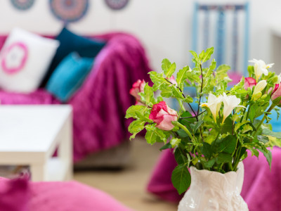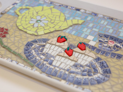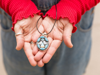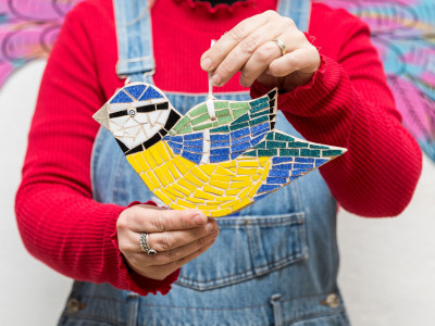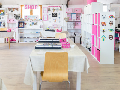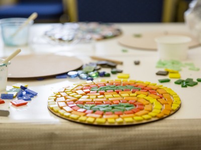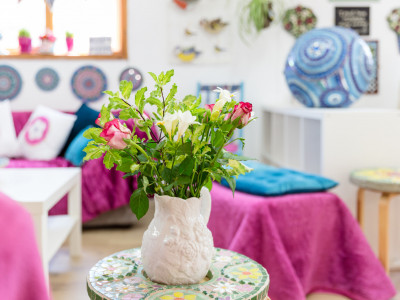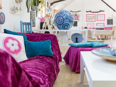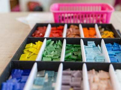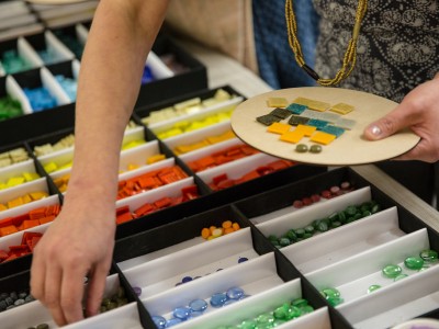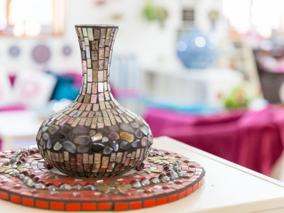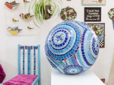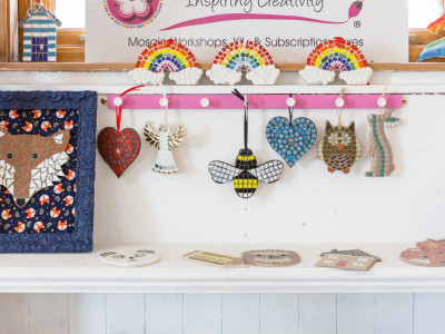
Colour has always been a key element in my work. I love the richness of colour, the effect it can have on mood, the impact it can have on a space.
It wasn’t until recently I discovered exactly why colour is so important to me. I was in the loft, rooting around for something, when I came across my ‘Colour Book’ from my university days. I studied Fashion and Constructed Textiles at Manchester Metropolitan University and, as well as working to design briefs, learning to thread weaving looms, painting life models and all the things you’d expect from an art training, we also studied colour. A lot.
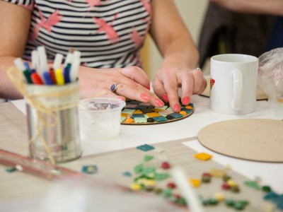
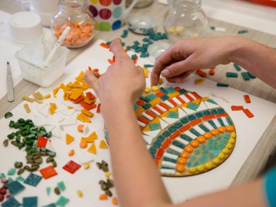
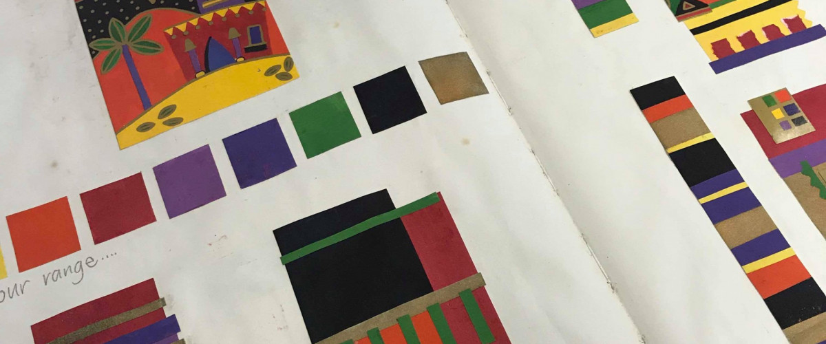
Our colour books were the equivalent to a dictionary. They were our reference, our log, our palette journal. It was simple. You chose a picture with colours you liked, it could be a postcard, a piece of material or an image from a magazine. Then you mixed all the colours in that picture and painted a swatch for each one – quite a tricky task, but the more you did it, the better you got at adding the right amount of paint to create the exact shade you were after. Proportions of different colours can have a huge impact on a design. So that’s what we were encouraged to do, experiment with different amounts of colour and stick the results in our book. Our colour book.
At the time, my friends and I thought it was a dull, pointless and laborious task. All the other housemates were out partying at the student union, whilst us arty types stayed in and worked on our ‘colour books’. But, I’m pleased to say that the hard work paid off and it is a skill that has stayed with me ever since, informing a great deal of my artwork now. Thanks to the persistence of my university tutors, I am confident with my use of colour and, to be honest, those Dulux paint machines have nothing on me – I am pretty hot on colour mixing too.
(IMAGES x4 BELOW)